UNIMATCH
Overview 👀
Duration: 3 Weeks
Role: App Concept UI Designer, User Researcher, Information Architecture
Tools: Adobe XD, Figma, Spline and Illustrator
Type: Concept – EdTech
Year: 2023
Concept
UniMatch 🎓
The app was created to address the challenge students face when searching for universities that match their criteria and profile.
Every university has its specific requirements, and even within a university, courses can have varying criteria. This complexity results in a convoluted and time-consuming process. UniMatch aims to simplify this process by offering a personalised university and course search engine that utilizes extensive databases. The main goal is to save time and make the selection process as straightforward as possible.
Agile Methodology 🔄
UniMatch” was created using Agile methodologies. I took an iterative approach to design this app. This allowed for continuous improvement, a user-focused design, and adaptability to changing requirements.

IS IT PRETTY?
Branding
Name Concept 🖋️
I chose the name “UniMatch” because it captures exactly what the app does – it matches students with their perfect universities. “Uni” is short and sweet for “university,” making it clear that it’s all about helping them.
Logo Concept 💡
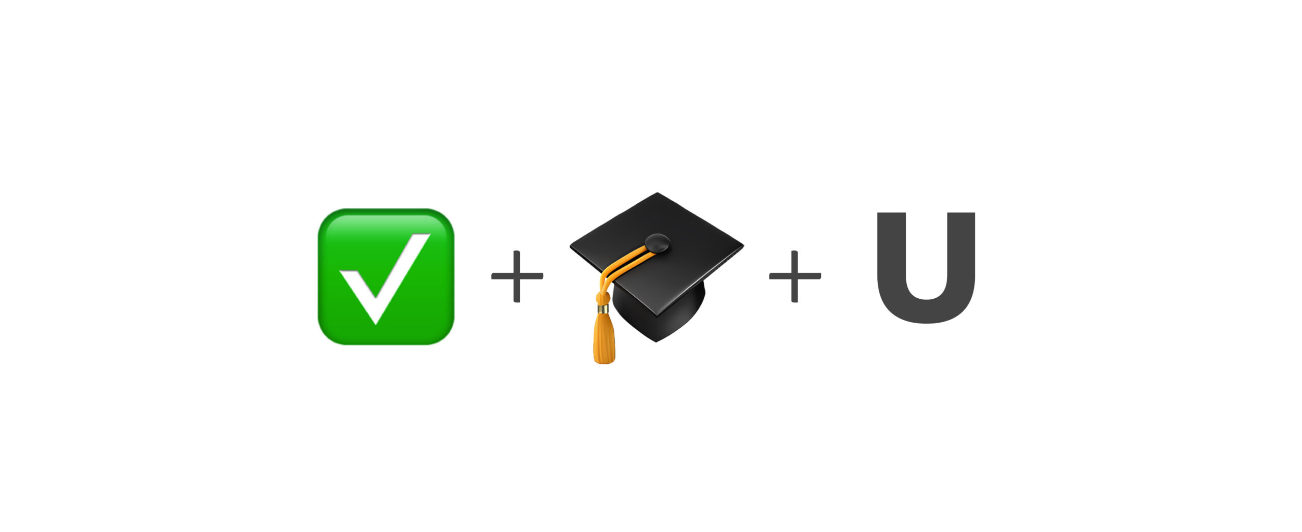
The UniMatch logo creatively combines a mortarboard, a checkmark, and the letter “U” from “university.” It underwent three rounds of testing, evolving from a sharper design to one with rounded edges for a friendlier look.
Test Versions 📝


Final Logo ✨
I put together this final version with some input from other designers, although most of the work was a solo effort.
The reason for choosing this design is that it effectively conveys the essence of UniMatch. It has a friendly and accurate representation of the app.
You can choose between two color options: green and white or green and dark grey, depending on your background preference.
Additionally, the logo includes a logotype where the check symbol seamlessly integrates with the letter “M” in ‘match.’ The typography used here matches the wordmark and is a modified version of the Raleway font.


Colours 🌈
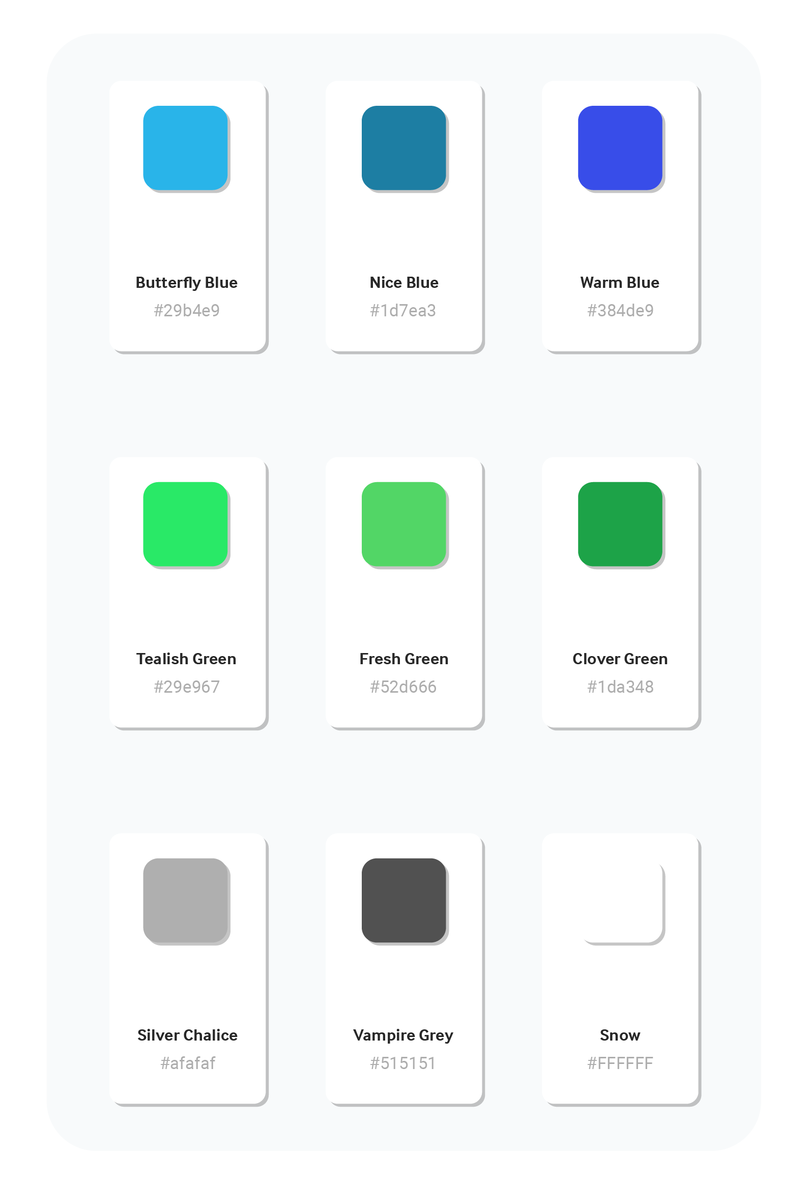
This color palette combines reliability and youthful enthusiasm, creating a visually appealing and dependable environment for your university search.
Primary Colours:
- #29b4e9: Reflecting endless possibilities.
- #1d7ea3: Symbolising depth and support.
- #384de9: Radiating confidence and empowerment.
- #29e967: Signifying growth, renewal, and excitement.
- #52d666: Inspiring enthusiasm and curiosity.
- #1da384: Representing balance and harmony.
Neutrals:
- #afafaf: Symbolising reliability and stability.
- #515151: Adding depth and sophistication.
- #ffffff: Conveying transparency and trustworthiness.
PRODUCT
User Interface
High Fidelity Wireframe 🖋️

Splash & Login 🔒
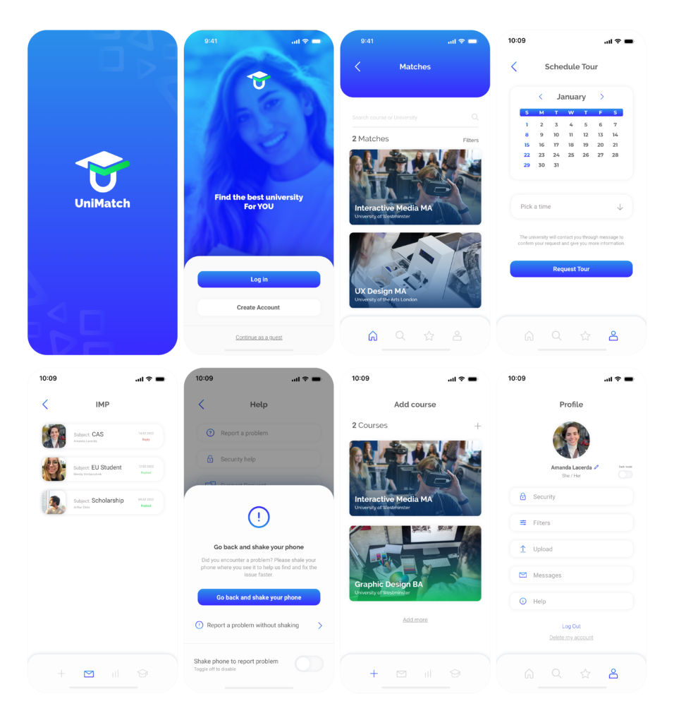
In this section, the application’s initiation process can be observed. The app displays an animated splash screen featuring the Unimatch logo, followed by a landing page offering login, registration, and, if preferred, guest access options. The login process provides the option to stay logged in or not and is straightforward. Additionally, the app offers the alternative to log in through Gmail, Facebook, or iCloud.
Register 📋
Since the app has two audiences, universities and prospective students, the user has the choice to register as a student or as an educational institution. The registration process is simple and quick, requiring only an email address, password, and acceptance of the terms and conditions. For educational institutions, as will be explored later, it is necessary to provide supporting documentation to ensure the app’s security against fraud.
Matches ✅
This is where the future student will find the best universities that match their preferences. The user can select criteria such as universities that accept “DET” and “GMAT” tests, field of study, location, level of education, and more. After selection, the user will find the courses that best fit the chosen criteria.
Search & Favourites 🔍
To facilitate the search for a course, the user can simply enter the field of study in the search bar, resulting in a list of matching universities. This list takes into account the filters added later by the user, displaying only the universities that match their profile. Since many courses may appear, the user has the option to favourite those that interest them the most, making them more accessible for future comparisons.
Compare 🆚
This feature allows the user to save favorite courses for later comparison. The user can choose which courses to compare within their list of favorites and receive a detailed description of each course or university. Viewing this comparison makes understanding easier, as it puts the information side by side, making the differences between the options clear.
GPA Calculator 🔢
The GPA, or Grade Point Average, is a number that indicates how high you scored in your courses on average. As this varies between countries, the app offers the possibility to calculate the GPA according to the UK system, which was the target audience at the moment.
University Add Course 🎓
On the other side of the app, universities have a profile where they can add courses. In this case, the university provides all the necessary details to create a course profile. In the video, you can also observe the process of creating an account for the university, confirming the need for identification documentation to proceed.
Reply 📤
Students can send messages to the university through the app, and universities can respond in the same way. There is an identification that shows which messages have already been answered and which are new. The process is simple, similar to using email, but with the advantage of being categorized by course, allowing each course to have its inbox.
Statistic 📊
Universities can view how many clicks each of their courses received, how many were favorited, and how many matches occurred. This is crucial as the payment system is based on PPC (Pay Per Click). The statistics are available in weekly, monthly, and annual graphs, analyzing each course separately.
Invoices 💰
Universities have control over the app’s invoices, being able to check which ones have been paid and which ones still need to be settled. Invoices are sent via email and can be resent if the university loses them.
ChatBot 🤖
Finally, it is possible to view the app version in night mode. The chatbot was developed to assist universities with questions or problems and is also available on the student’s profile.
Conclusion
The combination of these comprehensive features and functionalities, when complemented by a well-designed, user-friendly, and visually appealing UI, along with a strong brand identity, creates a powerful tool for young individuals seeking the ideal university that aligns with their criteria and aspirations.
