It’s no secret to anyone that I’m all about branding. It’s for sure my favourite part of design. It’s what truly excites me. This might not make much sense, considering I chose to study Communication with a focus on journalism during my undergraduate years and pursued my master’s degree in interactive media. But the truth is, branding is everywhere, and I simply adore it.
So, it’s only fair to dedicate a post to talk a little bit about the branding process of Dutchify. Why did I choose these colours? Why is the logo designed this way? Well, that’s what we’re going to explore here.
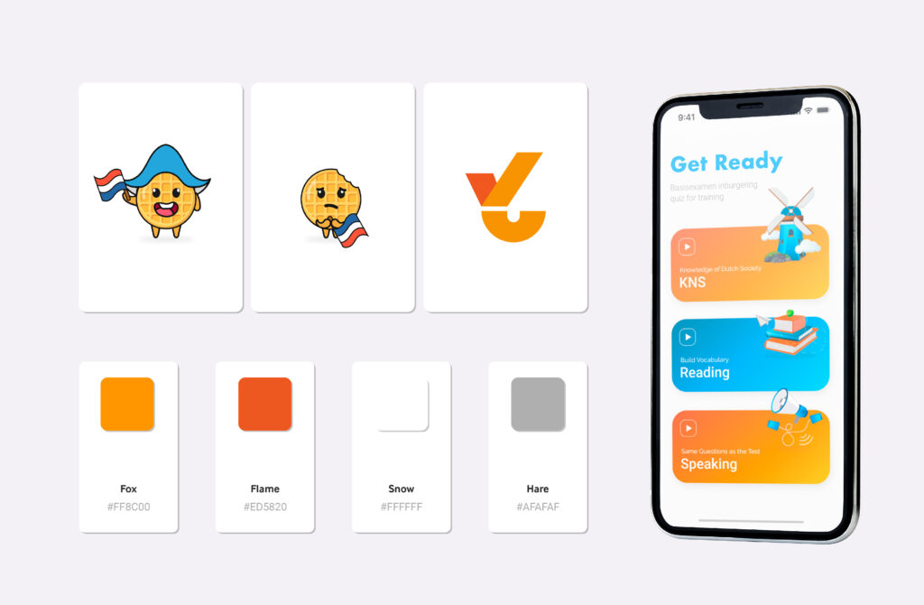
The psychology of colours plays an important role in how we connect with the world around us. Did I talk fancy now? I think so. In the Dutchify’s case, the choice of colours used in the app tries to reflect the brand’s identity, creating a visually pleasing and meaningful experience for users.
As primary colours, I went for:
- 🧡 Orange (#FF8C00): Fox is a vibrant and energetic colour, associated with creativity, enthusiasm, and warmth. In the context of Dutchify, orange represents Dutch culture and brings feelings of vitality and pride. It’s connected to the royal family and the national soccer team which makes a sense of belonging and national identity.
- ❤️ Reddish-Orange (#ED5820): This colour mixes the energy of orange with the intensity of red. It means action, urgency. Used to highlight important elements in the app, such as parts of the text, this colour catches users’ attention and motivates them to act.
- 🤍 White (#FFFFFF): White is associated with simplicity and clarity. In Dutchify, white as the main background colour brings a sense of organization, making the interface clean and easy to navigate. Additionally, white creates contrast to allow other colours to stand out.
Neutral Colour:
- 🩶 Gray (#AFAFAF): Gray is a neutral colour that represents balance. In Dutchify, it’s used for text.
Secondary Colours:
- 🩵 Light Blue (#1373AF): This lighter shade of blue inspires confidence, but with a softer and more open touch. It’s a colour that can be used to create a sense of space and visual expansion. Normally applied to buttons when clicked or in illustrations.
- 💛 Yellow (#FAD02E): Yellow is associated with joy, optimism, and creativity. Its presence in Dutchify brings fun and enthusiasm to the user experience. Used as one of the secondary colours, it’s part of the illustrations.
🖼️ Logo:
Our logo came from the Futura font with minor modifications, was adjusted to meet our specific needs. The final ‘y’ presents an interesting touch, resembling the shape of a ‘6’, the grade needed to pass the civic integration test. This creative move captures the essence of Dutchify. The logo can be used in Fox (default), Hare, or Snow colours.
✍️ Typography:
Did you know Steve Jobs studied calligraphy? Well, he did. That should show you the importance of a font in a project. He dropped out of college before completing the course, but his understanding of typography and design was crucial in creating friendly and appealing graphical interfaces in Apple products.
For my project, I carefully selected two fonts to enhance the user experience. “Inter” was chosen for titles up to 10 words, making it easy to read. Meanwhile, I opted for the “Roboto” font for the body text, ensuring smooth and pleasant reading. This combination offers clear hierarchy and harmonious aesthetics, contributing to an attractive and functional interface.
These two fonts were chosen considering digital screen characteristics such as resolution and pixel density. They offer excellent legibility even at small sizes, making them ideal for device interfaces like smartphones, tablets, and computers.
It’s also important to note that both fonts are open source, which means they can be used freely in personal and commercial projects.
Well, all these decisions helped make Dutchify a unique project. It’s important to remember that choices like these aren’t random; there’s always a reasoning behind a brand. Don’t underestimate that.
Anyway, I hope you enjoyed this post and share the same love for branding as I do. Until the next post!
#branding #UIDesign
